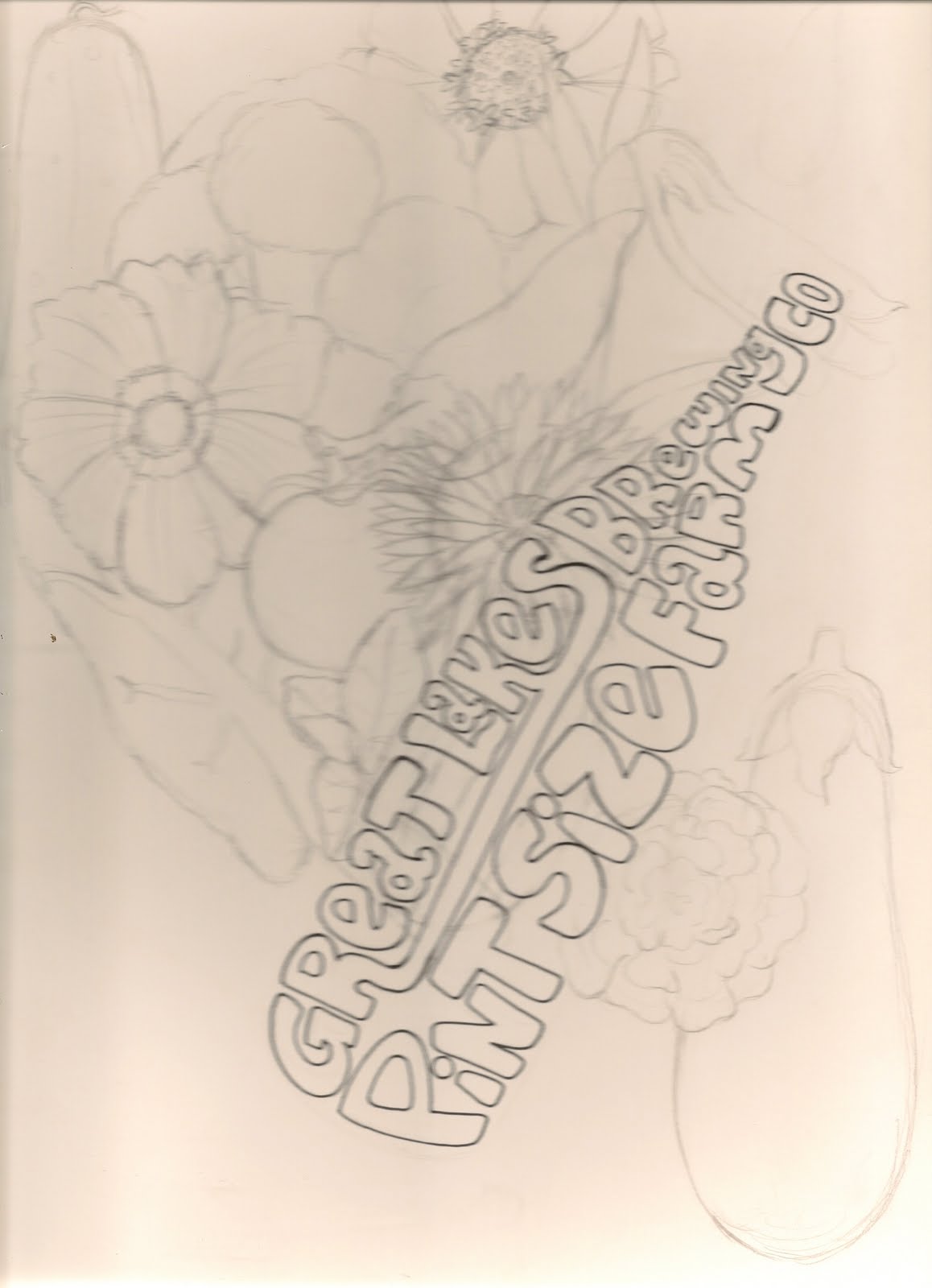
a pattern of it which I then place first in just the foreground and then in both the foreground and in the sky. Although Saul and Kami didn't dislike it they both felt that this design among it's variations was too busy (understandably) and that all of the lines made it hard to see what the actual image was. They also felt that all the flowers didn't play well to their demographics (males between their 20s-40s I believe is what they said.) They said that they wanted to keep things a little more simple than this. Going in with this one I figured it could have gone either way where they would have loved it or hated it and I totally understand where they're coming from with their criticism.


Images and concepts are the property of Great Lakes Brewing Co.